Baco Noir

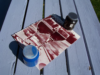
Now that I’m living in a burgeoning wine region, I thought I’d push my envelope and try a medium that few artists are working in: wine. How different from working in watercolours or inks can it be?

Materials (now featuring 100% more vino).

Where to begin? With the wine, of course. With dozens of wineries in Prince Edward County to choose from, I decided on the Sandbanks Estate Winery to feature first. Their signature wine is made with a grape called Baco Noir which is rare in this area (and, unfortunately, has nothing to do with bacon or back-hoes). My medium for this painting happens to be vintage 2007.

Initial results.

At first the wine looked like a light violet mixed with some red, but as it dried, it got a little darker, towards purple. Still, the wine was very transparent and, although perfect for the initial blocking-in of shapes, wouldn’t get me the intense darkness I prefer for deep contrast. I tried laying down a second “coat” on the wine parts after the initial pass has dried, but I could tell simply adding wine on top of wine wouldn’t cut it in the long run. I’d heard of other artists cooking the wine, reducing it as though making a sauce, to get it to a dark and a little thicker, too.


Small Pond Test Kitchen.

I didn’t measure the wine before cooking, but I poured a good number of glugs into the small pot and began reducing it on medium, testing the wine with a brush on scrap paper intermittently. After just over half an hour, I decided to stop the reduction for fear of reducing it all away. The wine was now darker, redder, and slightly thicker –not perfect, but better.

Reduced.

During the reduction, I added some water to the wine in my cup to lighten it and filled in the remaining white areas in the background and cutting board.

Pretty good for grapes.

The reduced wine looked pretty good –rich and deep red– but I discovered that wine takes longer to dry than regular watercolour paint. In fact, after laying down the latest “coat” of wine at around 11pm that first night, the painting was still wet the next morning at 8:30am, so I put it in the sun to dry. Exposure to sunlight might wreak havoc with the lightfastness (i.e. permanence) of the pigments, but I couldn’t think of another way to dry it (besides sitting over it with a hair dryer, wasting time and electricity).

The never-drying painting.

It's been a year now since this experiment (yes, the final painting below is dry) and my six new wine paintings are nearly done. I used three different wines, including the bottle of baco used in this experiment. Interestingly –but not unexpectedly– the wine has turned a rusty brown colour, both the liquid in the bottle and the wine in the painting, so the deep purple colour below has now oxidized and changed.

Baco Noir

15" x 11.5", wine on watercolour paper, 2010
(photographed in 2010)


See the follow-up here.


Comments

Popular posts from this blog

Axel Foley's Chevy Nova (1/25 scale model)

Multiple tributes, here. I remember first seeing  Beverly Hills Cop  on video at my friend Chris K's house, 'cause his family had a VCR and we'd watch tons of movies (and record music videos) together. The summer of 1984 was a special time for us (having created a strong bond in school since Grade 6 a few years before), going on biking adventures around the 'burbs and into the city, etc., and home video played an important role from then until I moved to the opposite end of Scarborough just before we started high school. We liked the movie a lot, both of us fans of Eddie Murphy from his  Saturday Night Live  days. I don't think I'd seen the movie since then (it would have been 1985, probably summer, since the movie came out in late 1984) and I became curious to see if it still held up. It did. It does. I found Murphy as charming as ever and the comedy (and even the action) holds up very well and its very re-watchable and very entertaining.  Beverly Hi

Small Pond Arts Puppet Wagon (1/24 scale model)

I dreamed up the Small Pond Shipyard for my fanciful scratch-built sci-fi airship creations (which still only exist in sketch/Photoshop mock-up form (and boxes in my closet) for now), but more and more ideas kept coming ( this wind turbine , for example, will be part of a rather elaborate diorama I'll be working on this winter). But the Puppet Wagon was a sleeper surprise, to be sure. [Really, though, I don't know why I was so eager to build this right away since I was planning to slowly develop my modelling skills with simpler builds first and the work my way up to more complicated projects.] Not all parts were used/needed. Most of these ideas have come from watching modelling videos online, and when I saw a review of this sweet little Japanese "Ramen Shop" food truck by Aoshima (right-side drive!), my brain started making jokes about customizing it to the weird food truck ideas I'd been posting on Facebook. But the more I thought about what the co

U.S.S. Enterprise, NCC-1701-D (1/1400 scale model)

Seven decades after Kirk. I'd been hooked on Star Trek since I was a wee lad in the 1970s, watching reruns of the original series from the '60s, and I enjoyed the movies that came out afterward. When a new series was announced to debut in 1987, I was excited and interested, even though I felt the subtitle "The Next Generation" was cheesy. Nearly 30 years later, I've definitely gotten used to it (but "TNG" is easier to say and type), but I still find it kinda bland. Anyway, the show had fresh new technology and a spanking new design for its main ship, the U.S.S. Enterprise , NCC-1701-D, now the flagship of the Federation. Andrew Probert 's design took some getting used to for me; it had the same basic elements of the original Enterprise  (saucer, neck, cylinder, and two cylindrical engines on pylons), but the shapes and volumes were distributed differently, weirdly. Everything looked squished and soft. The organic look of this new ship had me