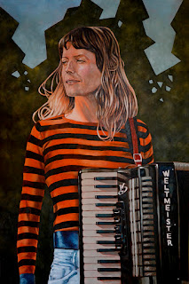
60" x 40", oil on panel, 2017, private collection
This is my portrait of Toronto-based musician, Kelsey McNulty, that I've submitted for the 2017
Kingston Prize for portraiture. She did a short residency at
Small Pond last year and we did a little photoshoot around the grounds. When I saw the results, I asked if I could paint a couple and submit one of them for the KP exhibition.
The other painting (
Kelsey Shade) I did was equally large, but was a tight close-up of her face and, while it also turned out well, I chose to submit this one because the musical element made for a better formal portrait.
Here are my previous submissions* for that exhibition:
George Emlaw (2011)
Self Portrait (Shoulders) (2013)
George Meanwell (Concertina) (2015)
*The Kingston Prize happens only every other year.
The big picture(s).
Both portraits in their pencil stage (on the left is Kelsey Shade) in my "winter studio" upstairs at Small Pond. It was like doing a residency in my own home, with me napping sporadically between painting sessions and coming downstairs only when absolutely necessary.
Get up, stand up.
Here's another sizing shot with me standing to do the upper half of the painting. This wasn't a problem, but I like to sit and work at eye level, since I tend to paint in stretches of one-to-two hours at a time with short breaks in between.
My
modelling gear is set up on that table behind me, but the paintings took precedence (as I worked like crazy to make the April 28 deadline) and I didn't get much building done.
Note the new 5-bulb "medusa" lamp behind me; two cool LEDs and three warm LEDs make for nice bright and colour-balanced light.
On the wall are a couple of paintings which were among my very first attempts at oils in the early 2000s:
Two Doorways (left), and
Stairway (right). On the floor to the right are two large commissions I was working on concurrently with the two larger portraits.
Blocking in shadows.
My usual first step, done with olive green.
Blocking in mid-tones.
Getting a feel for the planes of the face.
Highlights, etc.
Looking really weird and rough at this point. It's hard to accurately judge the colours because they're adjacent to that intense orange ground.
Further rendering.
It's really starting to look like a chalk drawing on coloured paper.
It also looks a little heavy-handed, but my instincts told me the colours and modelling are actually okay.
Hair mid-tones.
Inadvertent chalk drawing resemblance complete!
Also, blocking in the hair softened the harshness of the facial colours and reassured me that I was pretty much on the right track; I just needed to knock back some of that adjacent orange.
Reiterated shadows in hair.
Because these portraits are larger than life (the other one
much more so!) I could get in and play around with little brush strokes all over the place, not worrying too much about wrecking any precise marks (except for key areas in the face). Still –even in the bigger portrait– I wasn't about to render every strand of hair...that way lies madness.
More facial modelling and hair highlights.
Things are starting to come along nicely and I like the orange showing through here and there, giving some warmth and holding things together.
Background blocking.
The background of the reference photo was just a wall of trees and green leaves so I decided to break it up, bring in some sky, and do a simplified abstract treatment to contrast the yet-to-be-painted but highly-detailed accordion.
Sky complete.
I edged the treeline with olive green oil, but, the way I work (i.e. almost never any thinners), this was taking longer than necessary (and the deadline was relentlessly approaching)...
Quick-blocking.
...so I decided to use some thinned-out black acrylic to block in the rest of the background. That way, it would be dry sooner and allow some good, dark ground for my foliage.
A few more adjustments.
One last look at the face as I leave it alone to cure while I work on the rest of the painting in sections, after which I'd come back to it later with a few more final adjustments.
Background and shirt.
The trees are blocked in with a few highlights added and the shirt (minus the cuff) is now complete.
Early accordion.
We didn't plan Kelsey's wardrobe for the shoot, but that black and orange striped shirt really works for this portrait: the black horizontal stripes echo the horizontal lines of the accordion and the orange stripes tie in to her hair and skin colour. The alternating lines make a nice transitional element from warm organic to cool mechanical.
On second thought, yeah, I
totally planned it.
Face and hair refinements.
Final adjustments to the face and hair include super white highlights and further reiteration of dark shadows. And a few sculptural adjustments here and there.
Accordion refinements.
This. Was. A.
Beast.
I'm thinking of doing a whole series of musical instruments to make up for whatever shortcomings there are here...
I wasn't intimidated by the complexity of this instrument until I actually started working on it. But I wasn't worried about anything other than time. With only a few days left, could I adequately render this thing to look anywhere near satisfying? Well, "satisfied" will have to do...Am I happy with the accordion? About 85%. Happy enough to put down the brushes and hit the "submit" button.


Comments