A-Frame Burger Joint (1/72 scale study model)


In this post detailing my return to modelling, I talk about being fascinated by a model of a hospital I saw as a wee lad, and recently, I've expanded my modelling interests to include architectural models, starting with my test model of the former Bata Head Office in Don Mills, Ontario. I definitely have a preference for mid-20th Century modern architecture and its (now) retro futuristic look, so looking around the internet for suitable candidates for future projects, I immediately fell in love with the design of these small a-frame diners.

This a-frame design dates a little earlier in the 20th Century, the first instance I can find being the late '20s or early '30s and the burger chain, Hardee's, used this for many stores in their chain across the USA. I'll be taking the design and incorporate many details from real a-frames to make my own unique burger joint as part of an action-packed diorama.

1/72 or 1/87 scale?

Based on a particular element involved in the diorama (sorry for the vagueness, but I'd like to keep the reveal a surprise) I initially designed this to be 1/72 scale, but I found some elements for the project that were in HO scale (1/87) so I've decided to reduce the scale of the diner to match.

Lots of visual interest.

If you look at this structure directly from the front, directly from the back, or directly from overhead, it looks like an ordinary rectangle...but from all other views it's got lots of dynamic visual interest and almost appears as though there aren't any 90° angles at all.

Necessary mechanicals.

This is a great little set and with some proper painting and additional wire detailing, these will look nice and realistic on my diner. For some reason I have a fascination for mechanicals like these and kind of can't wait to be able to use more of these parts on other buildings.

HVAC sprue tour.

Two parts trees are all you get, but the parts are well-molded and nicely detailed. It says HO scale on the box and instructions but, once I put them on my model, they look a little large –and I'll be making the building smaller!

HVAC test fitting.

These HVAC units look pretty good on this 1/72 scale building but look like they might actually be 1/48 scale...which means they'll be way out of scale when I reduce the whole building to 1/87. There are a couple of smaller box units on the sprue tree, but no smaller vents. I'll do another test fit when the new, smaller building is done (or another test model is built) and see if I need new, smaller roof parts.

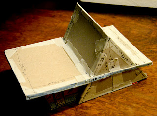
New numbers.

I really can't remember now why I decided to make the whole project HO scale down from 1/72, other than the whole diorama will take up a smaller footprint. I found and used an excellent scale converter online which helped my math-addled brain immensely. I've scrawled all the new measurements on the test model, alternating from centimetres to millimetres (wherever the closest round numbers were), and these will be my guides for the new, smaller diner.




Comments

Popular posts from this blog

Axel Foley's Chevy Nova (1/25 scale model)

Multiple tributes, here. I remember first seeing  Beverly Hills Cop  on video at my friend Chris K's house, 'cause his family had a VCR and we'd watch tons of movies (and record music videos) together. The summer of 1984 was a special time for us (having created a strong bond in school since Grade 6 a few years before), going on biking adventures around the 'burbs and into the city, etc., and home video played an important role from then until I moved to the opposite end of Scarborough just before we started high school. We liked the movie a lot, both of us fans of Eddie Murphy from his  Saturday Night Live  days. I don't think I'd seen the movie since then (it would have been 1985, probably summer, since the movie came out in late 1984) and I became curious to see if it still held up. It did. It does. I found Murphy as charming as ever and the comedy (and even the action) holds up very well and its very re-watchable and very entertaining.  Beverly Hi

City of Angels

17" x 11", watercolour and digital, 1999 Ah, City of Angels . I thought I was getting cool film noir but got a cheesy musical instead (Google it if you must). Still, it was fun to make the poster and associated images, mostly because the research consisted of watching real films noir and buying a great book on movie posters of the genre. I made tons of sketches and a few digital mock-ups. For the final poster above, I made three separate watercolour paintings (one of the couple and one each of the two black and white heads) and composited them in Photoshop, where I also added the text. In true movie poster fashion, I wanted the actors names to be the top two names, but I lost that battle and had to use the characters' names instead. It looks fine, but it implies that "Kingsley and Stone" are the lead actors in the show. Oh, well...it's only community theatre... By making the "angel" above half black and white and half colour, th

Small Pond Arts Puppet Wagon (1/24 scale model)

I dreamed up the Small Pond Shipyard for my fanciful scratch-built sci-fi airship creations (which still only exist in sketch/Photoshop mock-up form (and boxes in my closet) for now), but more and more ideas kept coming ( this wind turbine , for example, will be part of a rather elaborate diorama I'll be working on this winter). But the Puppet Wagon was a sleeper surprise, to be sure. [Really, though, I don't know why I was so eager to build this right away since I was planning to slowly develop my modelling skills with simpler builds first and the work my way up to more complicated projects.] Not all parts were used/needed. Most of these ideas have come from watching modelling videos online, and when I saw a review of this sweet little Japanese "Ramen Shop" food truck by Aoshima (right-side drive!), my brain started making jokes about customizing it to the weird food truck ideas I'd been posting on Facebook. But the more I thought about what the co