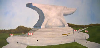
22" x 22", watercolour, 1999, private collection
Some time in the late spring or early summer of 1999 I got a call from a man identifying himself as "Rob Reiner" saying he was interested in having me do some artwork for his band's upcoming CD. It turned out it wasn't the "Rob" Reiner I was familiar with, but, in fact, "Robb" Reiner from the Toronto-based heavy metal band Anvil and the upcoming CD was their greatest hits package Anthology of Anvil. Now, I'm into all kinds of music –especially rock and pop– and have a knowledge or awareness of many bands whose music I don't personally own, even some obscure ones...but I had no idea who these guys were.
I can't remember how he said he found me or why he thought my art would suit a metal band's CD (this was when I was still only painting in watercolours), but I agreed to do the project (having done Squirm's Cold CD the year before) and met with them in their nearby practice studio in Scarborough (seriously: it was like a ten-minute drive from my house). During the very informal and brief time I spent with them discussing the cover concept, they seemed friendly and nice. I don't remember what was decided during that meeting, but one thing was certain: there had to be an anvil on the cover. They even let me borrow their mascot (an actual anvil) so I could take some reference photos and begin some sketches.
Monument.
The idea here was to illustrate a gigantic anvil monument dedicated to the band in an equally gigantic fancy park. Note the reflecting pool in the bottom right sketch.
On columns?
Okay, I don't get this, either; I was clearly still brainstorming.
The CD back.
The idea here is that the track listing of the CD would be listed as "engravings" on the base of the monument (you can see the "plaque" in the final painting).
Variations.
A different composition of a father taking his son to the monument and reading to him the list of songs (perhaps indicating his favourite one?). I included Canadian flags to help indicate this was a Canadian band.
Materials test.
I wanted to see here what the monument would look like in stone and in bronze.
Base Deco.
That summer I was also working on designs for the poster (etc.) for Markham Youth Theatre's production of City of Angels, and a lot of my research into Art Deco spilled over into this project. I think this was a bit too much for the boys, so I simplified the designs for the final painting.
More Deco.
Simplified Art Deco designs plus some refinement of the monument grounds.
Aerial.
Even more refinement of the grounds with some Deco motifs on the base.
Changes.
Refined base design looks good from above, but way too chunky from the side. Plus, another option for showing the plaque on the back of the CD.
Another back variation.
Drafting!
Now, this one I liked quite a bit: the back of the CD would be a blueprint-type design showing the plans for the monument with the song list in the box.
Drafting refined.
Here's an even better arrangement of the "blueprint" elements.
I don't remember how much back and forth there was between me and the band, but, in the end, they liked my ideas and I produced the painting at the top of this blog, which they also liked. I kind of talked them into it by emphasizing how cool the juxtaposition was of a beautiful and delicate watercolour painting gracing the cover a heavy metal band's greatest hits CD. I gave them the painting and they paid me fairly, but I guess their management didn't like it (or they had a change of heart) and went with this cover instead:
Incidentally, back in 2008 I noticed that there was a documentary about these guys called The Story of Anvil which I thought would be interesting to watch when it came on video. I only thought about it again a few days ago when I was deciding my next blog post and finally watched the movie, thinking there was maybe a very tiny chance of seeing my painting in the background of a shot. I was actually quite shocked to see this:
Looks familiar...but...weird.
Here's Robb's commentary during that scene in the documentary:
"That, right there, it's just a monument of an anvil in a park. Look at the size of the people; so I made the scale like, like that's big! Right? You know, like the Egyptians had had; it's like a god, you know, 'the god is there!' Anyways, that's what I was thinkin'."
I'm not looking for anything other than accreditation, and, anyway, it may be a case where we [that is, the band and I] simply came up with the concept of an anvil monument together, and Robb can paint whatever he wants to that effect (and that's totally fine), but Robb's painting is clearly based on mine from 1999*.
Compare:
Milé Murtanovski, 1999
Robb Reiner (possibly also 1999)
Robb's painting (based on my painting) is featured in a 2013 calendar he's selling on his band's website, and here, his painting (based on my painting, but with a new, dramatic sky –and they fixed the wonky horizon by making the monument appear to be near a body of water on the left), graces another anthology of their music, released in 2011:
I wonder what the back of the CD looks like...
*Over on Robb's Facebook page for his artwork it says his painting's copyright 1999, but I'd done a dozen sketches based on my own reference photos of the borrowed anvil before painting my picture, so, even if we did come up with the idea together, I came up with the images first.


Comments