War Progression

War Progression #1–4

After finding a great photo of a soldier walking down a road, completely loaded with gear, my brain started developing a loose narrative for him and his experience during the war. When I say "my brain" I'm referring to my subconscious collating a lot of the research I'd been ingesting and presenting me with ideas I still don't have a complete understanding of.

Is this one soldier's progression during the war? Is it a physical or psychological progression? Both? Does it represent soldiers in a broader sense? Is it the progression of the war itself? All wars? Is it my own psychological progress while spending nine months on this WWI painting project? These paintings could represent all of those, and any "interpretations" I offer would only be retroactive; as much as I "planned" the compositions, colours, and techniques used in them, they weren't as consciously planned out, metaphorically or symbolically, as, say the three paintings of Toys or Hangin' on the Old barbed Wire (among a few others).

Initial drawings.

Photoshop tests.

The ideas my brain presented were these: #1 would be rather straight-forward; #2 would have a double image and a cut in the canvas which I stitch up with red thread; #3 would be utter chaos, stylistically; and #4 would be serene but moody with a stark white background. I tried these concepts in Photoshop to see if I liked any of those "directions" from my brain.

War Progression #1
20" x 16", oil on canvas, 2014

The straight-forward one; a brown background instead of green for better contrast. Ring on right hand unpainted, and a slash across his left leg, both showing the orange acrylic ground I use in almost all my oil paintings.

War Progression #2
work in progress

Like I said, giving my interpretations about what's going on in these paintings would be no more insightful than anyone else doing so. Guided by my subconscious, I can only guess at the double image symbolism here: is he literally beside himself, baffled by the horrors he's seen? Am I beside myself, afraid I'd be overwhelmed by the enormity of this project? (this mini series was done quite early on in the overall production (July-ish, I think)). Maybe both, maybe something else entirely.

War Progression #2
work in progress

Based on my brain's initial direction (and the initial Photoshop test) I thought this painting would end up mostly white, like he's in a snowstorm or is fading away from reality, but I still wanted to put in some details and sub-surface colours before the white-out occurred, with the thinking that this would give the final painting some depth and richness. Or not –it doesn't really matter if you can glean any of this in the final painting...at least I know it's there (and I have the photos to prove it!).

War Progression #2
work in progress

The cut. It had to be done. Most likely inspired by seeing a painting an artist (and former colleague) made where he slashed one of his paintings and then stitched it back together. There's certainly an injury/amputation/loss theme happening that my subconscious has a better understanding of than my awake-brain.

War Progression #2
work in progress

It had to be red thread and it had to be substantial. Krista suggested needlepoint thread which worked perfectly.

War Progression #2
20" x 16", oil on canvas, 2014

The final painting wasn't as white as I had imagined, but, as is, it's the way it has to be.

War Progression #3
20" x 16", oil on canvas, 2014

"Chaos" was the direction for this one. Absolute insanity. Even though it's very abstract and surreal, this could be in his head or a representation of external conditions. Whatever the hell the case is, I knew I had to look at some abstract art to get a sense of how I wanted this to end up.

I looked at a lot of different stuff, but my mind kept coming back to Jean-Michel Basquiat and his distinctive work. In the Photoshop test I ganged up a few of his paintings in various layers to get a feel for it and to see if it would work. Then I made up a composition in Basquiat's style but appropriate to my project. I was very satisfied with the result and this painting emboldened me to try other artists' styles (where appropriate) to diversify the story-telling in the overall project. It also helped me learn a lot about painting, trying to figure out how others did their work. Exciting!

War Progression #1 & #4
initial drawings (comparison)

I began the last painting with a very loose drawing of the soldier, thinking maybe the lines would be visible in the end, creating a kind of blurry effect, but then I kept adding things...

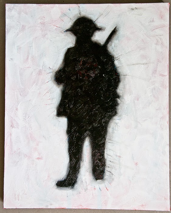
War Progression #4
work in progress

For richness and depth I used red and blue acrylic as the ground and, if I remember correctly, that's white gesso. I wasn't sure if the lines scratched into the gesso would be seen (even texturally), but they're there because they had to be. seriously: this mini series was like working on autopilot; if I believed in a muse I'd say I was guided by a muse. But it was my subconscious (through years of experience making paintings, and experiencing the world in its infinite variety) telling me to do things without explaining them. It's weird, but I'm satisfied with that understanding of it.

War Progression #4
work in progress

In comes the white oil paint after the blackness on the figure. I wanted something dark and textural, and for inspiration I was predominantly looking at the cover of Peter Gabriel's Passion album: 

"Study for Self Image II" by Julian Grater

I didn't mix as many media for my painting as Grater had for his (charcoal, bitumen, graphite, pastel, acrylic, beeswax, dry pigment, straw, and flower petals on paper), and mine's not quite as nuanced, but I knew it had to have a similar feel.

War Progression #4
20" x 16", oil on canvas, 2014

In the end I swirled the back end of my brush in the soldier's chest, revealing a tangle of red spirals, and scratched at the left leg, revealing red lines. Dripping water onto the leg made the paint run a bit, creating the trails.


Comments

Popular posts from this blog

Axel Foley's Chevy Nova (1/25 scale model)

Multiple tributes, here. I remember first seeing  Beverly Hills Cop  on video at my friend Chris K's house, 'cause his family had a VCR and we'd watch tons of movies (and record music videos) together. The summer of 1984 was a special time for us (having created a strong bond in school since Grade 6 a few years before), going on biking adventures around the 'burbs and into the city, etc., and home video played an important role from then until I moved to the opposite end of Scarborough just before we started high school. We liked the movie a lot, both of us fans of Eddie Murphy from his  Saturday Night Live  days. I don't think I'd seen the movie since then (it would have been 1985, probably summer, since the movie came out in late 1984) and I became curious to see if it still held up. It did. It does. I found Murphy as charming as ever and the comedy (and even the action) holds up very well and its very re-watchable and very entertaining.  Beverly Hi

City of Angels

17" x 11", watercolour and digital, 1999 Ah, City of Angels . I thought I was getting cool film noir but got a cheesy musical instead (Google it if you must). Still, it was fun to make the poster and associated images, mostly because the research consisted of watching real films noir and buying a great book on movie posters of the genre. I made tons of sketches and a few digital mock-ups. For the final poster above, I made three separate watercolour paintings (one of the couple and one each of the two black and white heads) and composited them in Photoshop, where I also added the text. In true movie poster fashion, I wanted the actors names to be the top two names, but I lost that battle and had to use the characters' names instead. It looks fine, but it implies that "Kingsley and Stone" are the lead actors in the show. Oh, well...it's only community theatre... By making the "angel" above half black and white and half colour, th

Small Pond Arts Puppet Wagon (1/24 scale model)

I dreamed up the Small Pond Shipyard for my fanciful scratch-built sci-fi airship creations (which still only exist in sketch/Photoshop mock-up form (and boxes in my closet) for now), but more and more ideas kept coming ( this wind turbine , for example, will be part of a rather elaborate diorama I'll be working on this winter). But the Puppet Wagon was a sleeper surprise, to be sure. [Really, though, I don't know why I was so eager to build this right away since I was planning to slowly develop my modelling skills with simpler builds first and the work my way up to more complicated projects.] Not all parts were used/needed. Most of these ideas have come from watching modelling videos online, and when I saw a review of this sweet little Japanese "Ramen Shop" food truck by Aoshima (right-side drive!), my brain started making jokes about customizing it to the weird food truck ideas I'd been posting on Facebook. But the more I thought about what the co